This week, I want you to scrap about YOURSELF, specifically, journal about your name--do you like it, hate it, have nicknames, etc.? Anything about your name is fair game!
Write down the letters in your name, and use items on your page that begin with each of those letters (could be the generic name of the thing or a brand). For the date, use: 3 - three-word title, and 28 - items (at least) .
Here's the page I made:
I challenged myself to use my first and last name and came up with these items:
D - doily
E - Echo Park (which was perfect since the April Work in Progress kit featured Echo Park's new Playground collection)
B - bradsB - banner
I - ink
T - ticket
E - embossing powder
H - heart sticker
R - rhinestones
A - anchor and arrows (I couldn't decide, so I used both)
N - numbers
I - insects (I was scratching my head trying to think of a second thing for the i, and it came to me that I could use insects, for this thing that bugs me--get it?)
Some details... Most of the stuff on my page came from the WIP kit, but I added a few extras from my stash. The ladybugs are old Jolee's photo corners--I ripped the photo corner off and just used the bugs. The stamp is by Studio Calico. I used red embossing powder--it's really shiny in real life. I traced around the postage stamp shape on the journaling block with a fine line pen. Isn't that pom-pom trim cute? It came in the kit. I was scratching my head trying to figure out how I was going to adhere it, and then it came to me to use colorful staples.
Trish packed some cute, colorful doilies in the kit (she always tucks unique, interesting little extras into her kits). Love the shape of this bright yellow one! The frame and journaling cut-outs are all by Echo Park. I cut the center out of the frame to tuck behind some layers. That word sticker, I think by K&Co, is sparkly and fun. I used one of my favorite fonts, 2Peas Weathered Fence, for the journaling.
The 2's came from an Echo Park patterned paper that was filled with numbers. I cut out several 2's to further the message of my page. I used a piece of the frame that I cut from the bottom of the one above. Aren't those little banners so fun? Again, they're from one of the Echo Park papers that's full of them. The arrows are also from an Echo Park paper in this collection.
There are my little rhinestones for the letter R. The chipboard circle on my arrow was a leftover piece from the center of a letter I used on a previous layout. It was sitting on my scrap desk calling out to me to use it. The "This is not a drill" is from a set of magnets I got at the Target Dollar Spot a while back with a bunch of sayings from "The Office."
This little emoticon is from that same magnet set.
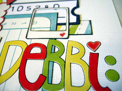
All the little bits below are by Echo Park. I outlined the letter stickers to give them some definition and stuck the heart on top of the i for my letter H. There's the ticket for the letter T. The little Polaroid frame is cut out from one of the border sheets.
Finally, I'm showing this picture because you can see the photo anchor I stuck in there for the letter A for the challenge, and to show you the outlining I did on the punched border.
So that's my second page from the WIP kit this month. You should go check out the awesome pages by the rest of the team in the WIP Gallery.
And you must go see the fun pages my teammates did with my challenge at HMITM. And please play along! You might just be chosen for our HAITA Hall of Fame and become a future guest designer!
Thank you for stopping by and reading about my page!


7 comments:
Love this one! So much details as usual...And I love your journalling...honestly..I too hate it when people cut your name short! Whats with that? lol
love love love it. the colors are awesome. see call you deb could be a form of endearment. i have peeps call me lynnie. snort.
This looks fantastic and I just love what you have written about your name. I don't mind being called Jas however but yes, we do get lazy and shorten names.
Great fun LO.
Hope I am excluded when I type your name Debbie....lol. Love the gorgeous colors you used on your page they are just complimentary. I am always a fan of your page, I love that you don't change your style to suit the trends and your journalling is always worth the read... This page Rocks!!!
Fabulous details and colors. Love your work!
Just LOVE LOVE your LO Debbi!!!
Sooooo much Amazing Details....
I love how you have traced it all with black pen.... FAB U LAS..
& with the name thing, I seem to have more of an Issue with people not spelling my name right... LOL!! we all have our little things dont we!
enjoy the rest of your Day!!!!
XXX
ALL RIGHT, Deb bi... so you and I... we got a common pet peeve going on here... I flip out when people call me Jing :) I had that "hypen" added to my name when I naturalized as U.S. citizen :) I should make a page about that :) lol.
Post a Comment