HOMEABOUT MERESUMESCRAPROOMLAYOUTSINSPIRATIONEMAIL
Showing posts with label Work in Progress. Show all posts

Thursday, February 2, 2012

No Sled {February WIP Kit}

The February gallery is up at Work in Progress, so I can start sharing my pages I made with this month's wonderful kit. Here's what we got to play with this month. So perfect for all the winter months, from Christmas to Valentine's Day. There are still a few left.


Here's my first page:


I used this sketch by Ashley Horton as my starting point. I met Ashley on my CSI challenge. She makes wonderful sketches.


Here are a few details: The snowflake punch is by Martha Stewart, and that little sparkly bubble is something I got from Hobby Lobby. I thought they kind of look like snowballs.

I meant for my journaling to be navy blue, but my printer was not being agreeable! My hidden journaling reads: How I wished we had one of those fancy wooden sleds with the red runners. But instead, when when it snowed, we'd head to our apartment building's garbage room , sneak the lids off the garbage cans, and head for the snowy hills. It wasn't fancy, but it was fun, just the same, sliding down those slopes.


I cut this bit off of one of the Echo Park journaling cards. The border punch is by EK Sucess--I think it's called bumpy road, and it's the first time I've used it. I thought it looked sort of like the piles of snow on the Echo Park elements.


And this little snowy scene was also cut from one of the journaling cards on the same sheet.


Go check out what the rest of the team made with this fun winter kit!
Thank you for stopping by my blog and reading about my page!

Saturday, October 8, 2011

Apple a Day {HMITM + WIP}

Making my page for our current challenge at How Much is Too Much coincided with work on my October Work in Progress kit, and when I opened the box, I discovered that the kit would be perfect for Janet's Johnny Appleseed challenge:

Our challenge this time is going to do a layout using apples in it. So it can be a recipe page, layout about fall or anything that uses apples. Since apples come in three colors I want the colors of the layout to have red, yellow and green in them.
3 apples

3 red,
3 yellow, and
3 green embellishments - ( buttons, brads, twine)

I'm a teacher, so I get a school portrait taken every year, and I never know what to do with them. I decided this challenge was the perfect opportunity to document my apple-a-day ritual, which I plan to add to my weight-loss album.


My hidden journaling reads: During the school year, I eat an apple a day. Every day, I bring an apple in my lunch. My favorite is apple is the honeycrisp. My apple-a-day habit started when I began Weight Watchers. I bring a knife and cut my apple into small slices so I can take a long time eating it. I usually bring a frozen Weight Watchers Smart One or a Lean Cuisine, which gets eaten pretty fast, and then I cut my apple and enjoy it for the rest of my lunch time. (School portrait - Fall 2011)

Here are a few details. I cut the flower and punched the apple image out of some Crate Paper papers from the kit. The little typewriter was from a Jillibean Soup paper. I added that green apple from an old October Afternoon paper.


I used the space in between the apple images on that pattern above to cut out the banner shapes. The border sticker came in the kit. It's also by Crate Paper.


Here's a coseup of my hidden jouranling card. I added a border sticker and a paper clip for some of my red accents to meet the challenge.


These nifty fruit labels came from a Crate Paper paper--there's a whole sheet of them, and I just love this ruler paper, also by Crate Paper.


Thanks so much for stopping by my blog and reading about my page!

Wednesday, October 5, 2011

Pose - WIP October Kit

Last month, we went to a family reunion, and on the way out of my cousin's garden, my 92-year-old Gram stopped at a hibiscus tree and asked us to take a picture of her. Gram loves gardens and even more than flowers, she loves to pose for pictures! We have a huge batch of pictures of Gram over the years posing in all sorts of sassy poses. It makes me smile to see that she hasn't lost her desire to be in front of the camera!

She pulled that giant hibiscus flower down near her ear and smiled for the camera. I thought the picture was perfect to use with some of the pretty papers that came in the October Work in Progress kit, which featured some papers from Crate Paper's Farmhouse collection and Jillibean Soup's Sweet & Sour Soup collection.


Here are a few closeups. I cut those flowers from a Crate Paper print and added Stickles to give them some pizzazz and popped on some pearls for dimension.


The frame was the perimeter of a Jillibean Soup paper. I cut the center out. That green frame beneath the photo is a journaling card.


The title letters are from that paper I cut the above frame out of, and the "sweet clover honey" is cut from a sheet of similar labels on a Crate Paper patterned paper.


Thank you for stopping by my blog to read about my layout today!


Saturday, September 10, 2011

Best.Class.Ever. {Another WIP Layout}

Well, school started a couple of weeks ago. I have a really nice class, and I just know I'll grow to love them to bits, but last year's class was one of the best classes I've ever had in the twenty-one years I've been teaching.

When I was looking for pictures to scrap with the September Work in Progress kit, I came across this picture of one of my students and me at the Fifth Grade Farewell, back in June, and I thought the photo was just perfect to go with the flowery paper I wanted to use. I put a little mask over my student's face since I wasn't able to get permission to post her picture online.


I used the pretty Kaiser Kraft tags that came in the kit to document some of the reasons I so loved my class, including how they were just plain nice to each other, how we spent so many days laughing, and how they just loved to sing!


I love these great big BasicGrey flowers I cut out of one of their Out of Print papers. I used red buttons topped with pearls to coordinate with the red tag I had used for journaling. I popped up one of the flowers with pop dots to give it some fun dimension.


Thank you for stopping by my blog and reading about my page today!


Saturday, September 3, 2011

Awesome! {Work in Progress}

Our gallery went live yesterday at Work in Progress Kits! Here's my first layout I made with the awesome September kit:


A little history on this page. Not too long ago, I was browsing Amazon.com to create a wishlist for my upcoming birthday, and I came across a book called The Book of Awesome, which has a sequel called The Book of Even More Awesome. There was this little video at Amazon advertising this book:


Needless to say, I put both of those books on my wishlist! I love the concept of this book, and I thought, wouldn't this be a cool idea for a scrapbook? So many happy little things happen every day, and wouldn't it be fun to document them and make a whole book of them so that when you're having a bad day, you could just open your own book of awesome? So this is my first page.

There's an alpaca farm on Route 85, which is a road we often drive (and a road I will be driving daily when we move to our new house), and a lot of times the alpacas are in their barn, but I get so happy when they are out on the lawn, and Farzad always pulls over so I can say hi!

Here are a couple of details from my page. I always wanted to try a corrugated cardboard background for my page. I just used an old box and tore it so it would fit on my page and peeled away the top layer. Those punched flowers came in the kit. Trish always includes little extras like die cuts and punchies in her kit.


Good old BasicGrey letters. I have just about every set to go with every collection, and I can always find just the right color I need. This one matched that blue floral tag. The scallopy design peeking out beneath the cardboard was a paisley-shaped BasicGrey Out of Print sticker that I cut in pieces and just hid the cuts behind the coardboard.


Another oldie-but goodie--K&Co. fabric brads. I love them so much and bought several packages because I was afraid once I used them up I wouldn't be able to find them. They always add a pretty touch. The pretty satin yellow ribbon came in the kit. I really love how ribbon looks, and I just don't use it enough!


The pretty tags are by KaiserCraft. I had a devil of a time figuring out how to fit those two tags on my page in just the right way (I wanted the pretty blue roses to show up on the light blue tag)--sometimes 8 x 8 pages are so tricky that way--until it dawned on me to turn one upside down, and that worked out just perfect!


Thank you for stopping by my blog and reading about my page! I will share some more of my work with this kit another day.


Thursday, August 4, 2011

August Work in Progress

I can finally share the pages I made for Work in Progress kits. Here is the kit I got to play with (sorry--sold out. Gotta snag it early!):


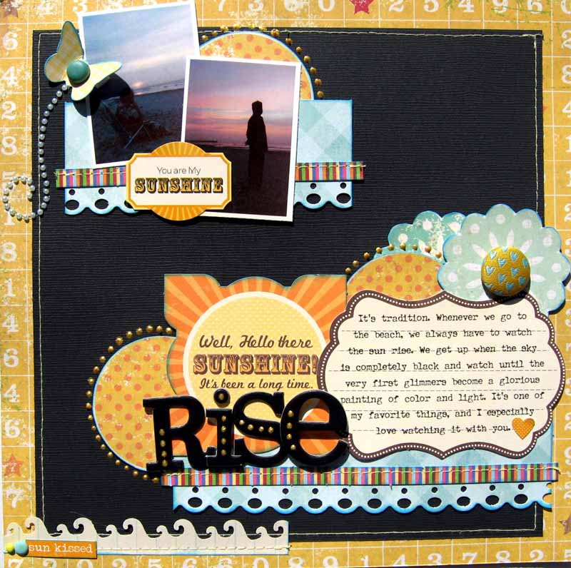
Here is my first page I made. I love watching the sun rise whenever we go to the beach, and Farzad and I always get up early to see it. We took pictures one summer of us watching. The butterfly shadow is covering me up, but I'm in that picture I'm sitting in a chair watching it. I was trying to figure out a title for my page, and I decided "Rise" was the perfect title for it's double meaning.


I used Creative Scrappers Sketch 164 to make this page. Ever since I've been on the CS design team, I made it a secret goal to try to do all of their sketches. Might take me forever, but it's a fun goal. I love setting scrappy goals. Keeps my scrappy routine interesting!


And here are some details. The yellow paper in the background with the numbers is by Simple Stories. And the flowers and yellow and orange polka dot circles are from the opposite side of the same paper. That journaling spot is by Jillibean Soup. The BasicGrey fabric brad is from my stash.
 

I didn't originally have the gold dots on my title and around the circles, but when I looked upon my page with fresh eyes the next day, I realized I neded a little something-something on my page. I made the dots with Scribbles 3D paint, which you can pick up at Michael's for about a dollar. The colorful striped element is by Jillibean Soup.
 

The wave punched border is another "fresh eye" addition," along with the sticker and brads. It gave my page a visual triangle that I felt was missing. Plus I always love how word stickers can add to a story.
 
 
So that's my first page with this fun, summery kit. I'll share the others in the coming days. Thank you so much for stopping by my blog and reading about my page today!
 

Thursday, July 14, 2011

A Quirky Memory with the July WIP Kit

Here is my second page using the elements from the July Work in Progress main kit and project kit (the project kit is sold out, but the main kit is still available). The colors were so fun in this kit that I had to make a playful childhood memory page. And this one is quirky! I had a kind of long story to tell, which is a challenge to squeeze onto an 8 x 8 page, but I didn't want my journaling to be hidden for this one because it's the story that's the star of this page. I chose a random picture of mini-me to be in a supporting role.


Here are some details.  How fantastic are these butterflies! Love the dimension and that they're translucent and vivid at the same time. Plus they're just the right size--not too big for my 8 x 8 pages. They're made by Recollections. I must get some more of these.


These fun clouds and kites were cut out of one of the My Mind's Eye Lime Twist papers. I outlined them with black pen to add a little extra interest to them and then added a button and two periods from the chipboard letter set I used to the kit centers.

My "extra" that I added the next day when I gave my page a second glance before photographing was the Magic Mesh. I still have a whole drawer of that stuff. I wonder if you can still buy it? I'll be sad when I run out if it's no longer available!


Those orange pearls that came in the kit were just the perfect size to fit inside the green polka dot paper.


Trish included these cool number tags in the kit. They were originally kraft, but I wanted mine to be a different color to tie in with the bright papers I was using, so I painted it with some Making Memories paint. For my random childhood memory pages, I always like to include a "Random No." and this tag was the perfect thing for this! The tag was actually much longer, so I chopped it in half to fit on my small page and then disguised the cut with some of the zig-zag paper. How fun is that orange hemp cord. It also came in the kit on a card with four different colors.


Thank you so much for stopping by my blog to read about my layout!


Thursday, July 7, 2011

Work in Progress - July

The July Work in Progress kit is so pretty and cozy and summery:


Here is the first page I made. Each summer, I've been making a page about things on my mind, and this is big-time on my mind this summer:


That's the house we're buying. It hasn't been built yet, so I grabbed a photo from the website. My journaling on the back reads:

Summer 2011 will go down in history as the summer I spent getting ready for our new house. Decluttering. HOW do two people accumulate so much junk in two decades? Cleaning. Moving things that haven't been moved in eons reveals gigantic dust bunnies (dust elephants?). Dumping. Yeah, the guys at the dump now know Farzad on a first-name basis. Packing. Thank goodness for all those McDonald's French fry boxes. Storing. Our attempt at making our little house seem roomier. Improving. Putting more floors in, redoing the walkway, planting, mulching, overall making our house shine and sparkle. Dreaming. Yes, all this hard work will be worth it when we finally get to move into our dream house.
Here are some details. Love the butterflies that came in the project kit. I used a flower from my stash.

The little typewriter and clock images came from a Pink Paislee paper in the kit. I thought they were perfect for this page. I roughed them up with my Zutter Distrezz-It-All.


Love these calendar tickets. I had used the August one on another page, darn-it! I trimmed the cut-off strip from a paper that said "coordinating pattern on back" and used it to indicate that I had hidden journaling. Love those Lily Bee letter stickers. They're small and perfect for adding subtitles.


The July kit is still avilable. The papers and embellishments in this kit are perfect for summer but are also so versatile. If you've been wanting some of the new Lily Bee stuff, this is the kit for you!

Thank you for stopping by my blog and reading about my page!


Sunday, June 19, 2011

More layouts from the June WIP Kit

I've been so busy with school ending that June is getting away from me, and I haven't shared all my Work in Progress layouts. Trish just put the July kit up for sale, but there are still a few more June kits left--such a colorful, happy, summery kit, featuring Echo Park Summer Days and a bunch of other fun, colorful goodies!

Here's a page I made for my book about Farzad's [many] quirks. I randomly number the quirks in this book, and the playing card paper that came in the kit was perfect for this. "Besalamati" means "cheers" in Farci, and Farzad always says it when he's about to drink something, even non-alcoholic drinks.


And a couple of closeups... That little umbrella drink sticker was the perfect thing for my page. I outlined it with a fine tip pen and added the layered punched circles, mounting everything with pop dots. I added some sparkles above the drink to make fizzy bubbles.


I love the woodgrain and cloud papers that came with this kit. I used pop dots to lift up one of the clouds. Again, I outlined the clouds with a fine tip pen, as I did with the other stickers.


Here's another page I made with this kit. When I saw this big ferris wheel sticker in the kit, I was immediately reminded of trips to amusement parks when I was a kid. I'm pretty sure we went every summer, but I only have this one picture of my sister on a giant slide as evidence that we went.


Journaling on the back reads: Sure, we went to Bolivia three times, but with the exception of one trip to Florida and a couple of beach day trips, we never went on any kind of real vacation. I do remember piling in the car once or twice a summer to drive to Kings Dominion or Hersheypark. I remember the thrill of seeing those sky-high roller coasters and the Kings Dominion Eiffel Tower as we approached the park. We'd always go on the weekend because my parents worked and the wait was so long as we snaked through the queue, but the thrill of zooming down the roller coasters was worth the wait. My favorite ride at Kings Dominion was the Rebel Yell, a giant white wood roller coaster. You could ride it forward or backward. Oh, and the Time Shaft, a mind-blowing ride circular room where you'd stand against the wall and the room started to spin. All of a sudden, the floor would drop and there you'd be hanging on the wall! At Busch Gardens, I loved the Big Bad Wolf, a suspended roller coaster, and the Shockwave, a stand-up roller coaster that went in a loop. Love, love, love those loops and the exhilarating sensation of curling upside down. My favorite ride at Hershey Park was the Toboggan, a little car that went straight up a tunnel, so that you were lying on your back, and when it emerged at the top, you'd go down a spiral track that surrounded the tunnel.

Sure, we never went to Disneyworld or the Grand Canyon or any of the other adventurous places other kids we knew went, but to us, these amusement park day trips were pretty exciting!

(This picture was taken in the mid 70's at Kings Dominion , and I think I can spot Dawn on the right.)
 
Here are a couple of detail shots... I added tiny Queen & Company brads to the feis wheel buckets. Man, what a pain that was, I tell you! After I started, I was wishing I hadn't thought of doing this. It was so hard poking the brads into the sticker, and the little prongs on the back were all stuck together. I mounted the giant sticker on pop dots. I outlined some of the elements with a black fine-tip pen.
 

This journaling spot was fun with the little roller coaster. I added some more of those brads to the wheels. I outlined the cars and the card with a fine-tip pen.


Those stripes at the bottom were fun and colorful, but I felt they were missing something, so I added brads in the same colors as the stripes. Yeah, I'm a glutton for punishment!


Thank you for stopping by and reading about my pages!