Here's how I solved this Case File. Clues I used...Evidence: Circles, swirls, tone-on tone patterns, pom-pom trim, architectural accents, something upside-down, birds; Testimony: Directions.
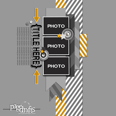
I had to make my page after work again last week, so being in a bit of a rush, I turned to a sketch. I used one of Em Stafrace's fabulous Page Drafts--the one currently up at Paper Stories. I love this sketch so much that I went pretty literal with it, and the page came together painlessly. (I tend to agonize for hours over the placement of everything.)
I lied a little. I struggled a bit with the upside-down element. I tried the bird, but it looked like a dead bird. The house looked awkward upside-down. My husband came into my scrap room and saw me frowning. I told him I needed to put something upside down. He looked at my layout and told me to put the pom-pom trim upside down, and I said well, there's not necessarily a right-side-up with trims. He came to my rescue and suggested putting one of the photos upside-down, and I loved how that worked out! I painted a Maya Road chipboard house and added glitter, but the glitter started sprinkling off, so I added Glossy Accents. It made it so shiny!
I used lots of old paper on here--the old Scenic Route Metropolis was an almost perfect match for this palette. I also used some old October Afternoon papers.
The blue circles were made with a Crafter's Workshop template. I used molding paste mixed with a little blue paint. I was thinking how I'd love to add some mist, but I always screw up mist. I need to practice using that this summer. I remembered some old Stampin' Up Stamps that look like splatter, and that's what I used. I love how well that worked out! It's funny--I almost got rid of those stamps a few years ago, before the whole mist trend, and I'm so glad that I'm a packrat and kept them instead. The cut-out circles sort of reminded me of spirals, for the Evidence, but I also drew a few spiral-y outlines on some of the circles.
Here's a closeup of my journaling. I went with the Directions prompt, that I thought was a fun way to document my little old boy's bed-time ritual.
I couldn't find the right color letters that would fit in the space, so I painted some Webster's Pages letters with the blue paint that matched my circles, and I added glossy accents to them. If you click on the image below, you can see how shiny they turned out.
Here's one of those Studio Calico birdies that seem to be appearing on a lot of my pages lately. He looks totally different covered with glitter instead of left in its raw wood veneer state.
You must go see what the rest of the team and our guest designers made--really fun stuff in the reveal. I hope you'll play along.


11 comments:
so awseome Debbi, love all of this especially the pics xoxox
What a fabulous and fun layout - I really love this color combo!
Very fun and adorable. Love the design.
It's always fun to read about how the page evolved. How each step can be adapted if it doesn't look quite right. Love this page Debbi :)
I'm with Heather - love reading your 'blurb'...& SU do have really great stamps! This is one of my fave LOs..that glitter & the outlining on the photos & circles...looks great. I really liked that sketch, too.....fab job...hope you're not TOO exhausted from the school graduation:):/:)
Fabulous layout! Love how you have combined the challenges - the colours are so striking and the journaling brought a smile to my face. Cute little glittery birdie too!Great take on the sketch. Thankyou for joining us at Paper Stories!
Just simply love it all. Cheers Di xo
Awesome take on the challenge - love those circles! Thank you for joining us at Paperstories! ;)
Amazing hunnie, so cool you combined the two challenges and am swooning over your fab page you rocked the sketch xox
Gorgeous layout Debbie! Love your thinking on the mist splatter...I still get nervous about using mists on my layouts..lol!! Thanks for playing along at Paper Stories :)x
Husbands can give great advise (sometimes). Your layout is lovely. Love the colors and the circles.
Post a Comment