Wow! It's been almost a year since my last blog post. The past few school years have been extremely stressful and busy, but I am now officially retired as of last week, and one of my goals is to keep up with my blog. Not sure if anyone reads it, but it's satisfying for me to document my scrappy pursuits if for no other reason. If you do read my blog, can you drop a note in the comments?
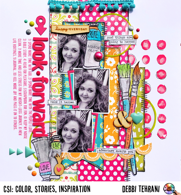
Over the next few weeks and months, I'm going to intersperse my blog posts with ones I never had a chance to write. Today, I'll begin with my most recent layout for CSI:
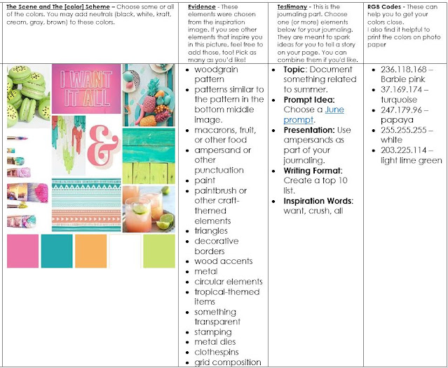
Here are the Case File and clues that inspired my layout:
Clues I used: I used the color scheme and a combination of the prompts from the Testimony to write a list of things I'm looking forward to doing in my retirement, which was a week and a half away from the time I created this layout. Evidence clues I used are: pattern similar to the one in the scene, fruit, ampersand, paint, paintbrushes, triangles, decorative border (in the form of pom-pom trim, wood accents, metal, circular elements, tropical themed item (the pineapple), something transparent, stamping, and metal dies.
Sometimes when I get stuck, I scraplift myself, and this layout that I made 9 years ago popped up in my Facebook memories, so I used that as my design inspiration. You can see the inspiration for that layout here.
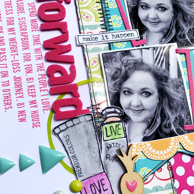
I've said it lots of times before, but one of the things I love about my challenges is that it gets me digging into my stash, and I used almost exclusively older stash for this layout and even though it's scraplifted off of a layout I made almost a decade ago, I still think the page looks fresh and new. That floral/scallop paper is an old paper by My Mind's Eye. The lettering for the title is a really old set of Thickers. The font is one of my favorites--2Peas Tasklist. I used to buy all their fonts and over the years of acquiring computers, I've lost track of all of the 2Peas fonts except this one.
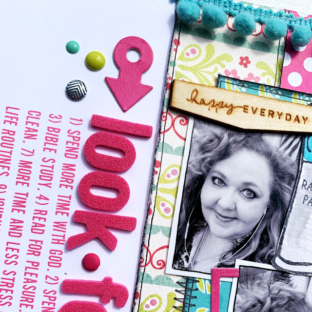
I always try to cram in as many clues as I can, and in this one small close up I've got wood, 2 metal dies, pattern like the one in The Scene, metal dot, a decorative border (the pom-pom trim), and circular elements.
I always try to cram in as many clues as I can, and in this one small close up I've got wood, 2 metal dies, pattern like the one in The Scene, metal dot, a decorative border (the pom-pom trim), and circular elements.
I chose a stencil to add some more circles--this stencil is from Bramble Fox. I mixed texture paste with some watered-down Distress ink and it wasn't exactly the color I was going for and it looked blantantly off, so I swiped a bit of gesso with my finger on each the circles to take the emphasis off of them. That did the trick and gave them an interesting look. I may try that again! I love happy accidents!
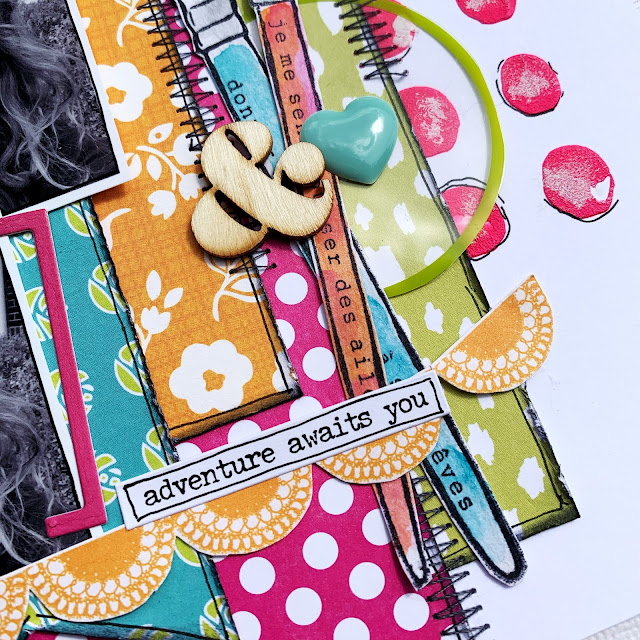
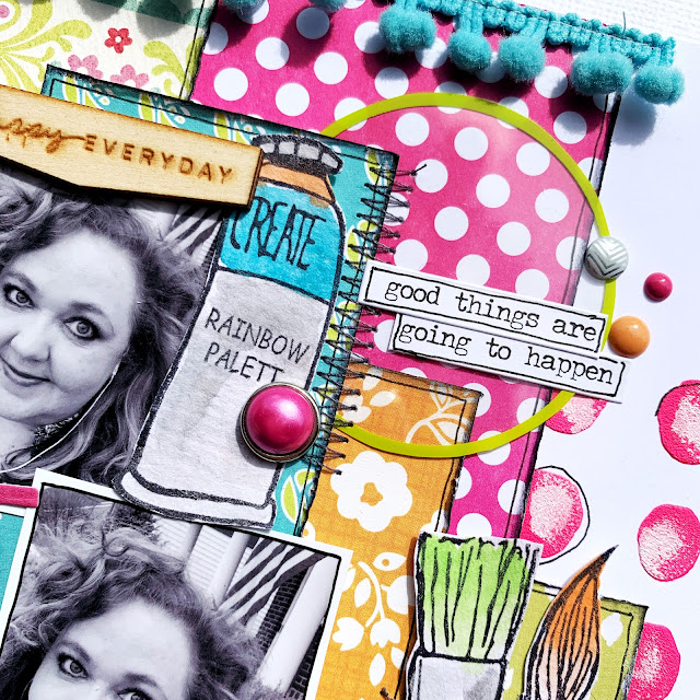
In this closeup you can see I used the something transparent clue--I fussy cut some circles out of an ancient Hambly transparency. The wooden ampersand met two clues--ampersand and wood.
When I was looking for an orange patterned paper, I came across this old banner pattern by Studio Calico and fussy cut a strand of it to add an extra bit of happy celebration to my page.
And of course I love it when I can find the perfect phrase stickers in my stash to help me tell my story.
Triangles were a clue and I found some enamel ones to match the heart I used in the photo above. I was trying to figure out how to include a tropical-themed item, which was one of the clues, and I found a pineapple in my stash to make a visual triangle with my other two wooden pieces, and I figured it wasn't too much of a stress to include a tropical item on this layout since I'll be in a perpetual summer break of sorts!
I just love the bracket die from Simply Graphic. I used it to highlight a picture of me on my morning walk because I look happy in this picture and also one of my main goals in my retirement is to finally get my weight loss journey under control now that I don't have the stress of my job. You can see I added another Hambly circle for another visual triangle on my page.
I also used the paint and paintbrush clues--the paint brushes and paint tubes were stamped on watercolor paper and then I painted them with cheap watercolors. (Stamping is also one of the clues-so that was a triple play!) I raided my paper scraps drawers to find papers in the colors of the Case File, roughed up the edges and add some outlining to give them extra detail and then zig-zagg stitched them for added texture.
To round out my layout I found a third perfect phrase sticker with a wonderful promise for my retirement to create one more visual triangle.




1 comment:
I have your blog in my Feedly and enjoy the extra details you include here about the products you’ve used or the design choices you’ve made.
Post a Comment