Here is my favorite page I made. Trish sent us some little Work in Progress buttons, which is where this layout began. It's a little ripply from gluing on the letters, which is why it has that weird shadow (but it's calming down now).
Here's a close-up of that button. I trimmed a Martha Stewart label and adhered it to a punched circle on top of a silk flower I got from Michael's.
I love how all the little bits of varied patterned papers look lined up together. Love, love, love the fabric tape Trish included in the kit!
I love the way white letters look against white paper. I've done that on many layouts. I added some scraps behind the openings of some of the letters.
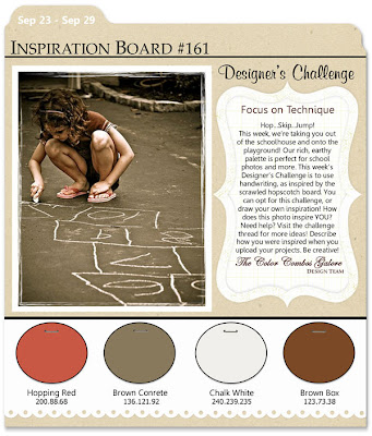
Here is a layout I made for Color Combos Galore. The kit was perfect for this palette:
I made a page for my weight-loss album. This picture was taken last winter. I've lost more weight since then.
The tabbed border came from a Teresa Collins paper in the kit. I cut it out and trimmed it down to fit my 8 x 8 page. The fabric tape was from the September WIP kit, and I pleated it before stitching it down. LOVE the Crate Paper ruler paper that was in this kit!
Trish always includes really nifty die-cuts in her kits. This month, she sent us two little olive trees. I painted mine brown to go with the palette and added stitching. One of my favorite embellishments iw word stickers, and 7 Gypsies are my favorite. I added some phrases from the "D is for Diet" sticker set. The report card is cut from a Crate Paper sheet that was in the kit. What a fun way to journal!
Also in the kit was a Bo Bunny paper that has all these little flash cards. A million of them! So I have lots left for other layouts.
I'll share the rest of my layouts during the week. In the meantime, be sure to go check out what the rest of the team did with this awesome kit!


5 comments:
Beautiful pages! I love the bright colors & strip of photos for the WIP one. And loving the warmer tones to the weight loss one - way to go! I know it isn't easy. tfs! :)
awesome pages. love it all. the white one just pops. yum!
a-dorable! love both layouts!
That page about WIP, seriously phenomenal, so extremely well designed, and what a BRILLIANT idea to use that pin as the flower center!!!!!!!!!!!! squuuuueeeeeeeal
I also absolutely adore the pleated ribbon look, what a great way to use up that tape from a previous kit!! Love those colors, very very soothing!
I love the photo row in your first layout! Amazing idea! The title is really cool too--big and white. Clever. The second layout has some really cool ways you used ribbon. Great Work!!
Post a Comment