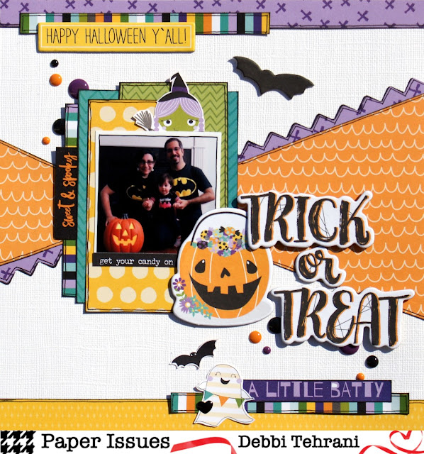
I loved lifting Kat's beautiful layout--such a fun and unique design! I pretty much copied the basic design, except I used one photo instead of three.

Here are some details. I used Bella Blvd's Sweet & Spooky Collection. There are so many fun elements to fussy cut from this collection. The Sweet & Spooky tab is from the branding strip. The little witch girl was at the edge of the paper and I hated to see her go to waste so I put her peeking out from above the photo.
The chipboard pieces in this collection are so cute! Pretty much everything on this page is from the collection, except the enamel dots and the Tim Holtz word stickers. I put a little heart on the ghost because I'm adding a heart to each page I make for this little girl.


No comments:
Post a Comment